Thursday, February 14, 2013

Nike+ and Matlab: part 2

In an earlier post, I described my first efforts at writing functions for using my iPod Nano with Matlab (here). As I pointed out, that wasn't functionality that I was really missing; in other words, I could do the same with Excel, though not with the Nike+ website.

Because that Matlab is such a powerful interactive and programming tool, it's easy to add functionality when you think of a new need. For example, yesterday I ran for 36 minutes, divided into a 10 min easy warm-up, and 26 mins at pace. The Nike+ website gives me:
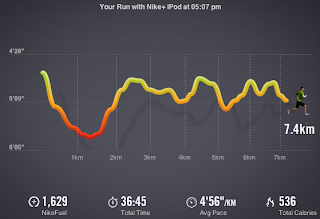


which doesn't quite reflect the nature of my workout. Instead, what I want is the following:
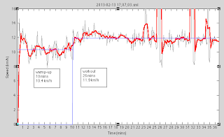


This graph makes a lot more sense. You can see I have marked the average speed for both the first 10 mins (10.4 km/h) and the subsequent section (11.9 km/h) separately. I have overlaid the plot (raw and smooth) with the averages for the two sections as horizontal lines in blue.

To plot the recorded data, I simply call the nike function from last time:


Note, I've modified the call (and code) a bit to return both the number of data points collected and the array itself. (This is because I'm going to massage the data a bit.) At this point, I notice that there are a few blips in the data. There are two recorded data points that say I'm running at 60 and 80 km/h, respectively - which of course, is absurd. These data points will affect the average speed recorded, so I'll want to remove them by running another function that I wrote for the purpose, called rmoutliers:


It returns n, the number of outliers detected, and the modified array (a). Here, n=2 and all is well. How did I define what constitutes an outlier? Well, I crudely decided that 3 standard deviations away from the mean would count. Here is the code:
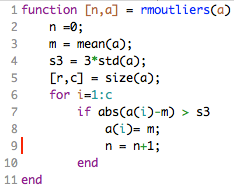


Notice I simply decided to replace those outlier points with the mean. (I could do something different and a bit more realistic, like use a moving average, of course.)

Finally, I want to overlay my average speed for the first 10 minutes and the rest of the run. We can add another function plotavg as follows:
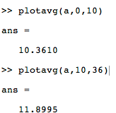


I wrote this to say plot the average for mins 0 through 10. And then the average for mins 10 through 36. And in both cases, tell me what the average was for the defined segment. The code is very simple:
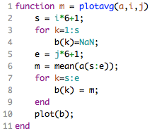


The end result is:


This functionality is simply not possible using a program with a simple, fixed menu of options because there will always be more things you'd like the program to have that you didn't think of initially. And one might be reluctant to dig into code and recompile an updated application just for one more function. But because Matlab is so programmable, these tasks are easy to do even on one-time basis.

Wednesday, February 6, 2013

Learning by doing: Nike+ and Matlab

I subscribe to the view that the best way to learn a complex and powerful tool or programming language is by doing.

Matlab is particularly nice for dealing with quantitative data. I decided to dive deeper into the tool by coding up a graphing application for my treadmill workouts recorded using the Nike+ application that samples data from the built-in accelerometer of the iPod Nano.

This is not necessarily functionality that I'm currently missing; normally I use Excel or the Nike+ website (based on Adobe Flash). Perhaps Matlab is overkill, but there's something deeply satisfying about smoothing the accelerometer data using just one function call like:

c = smooth(b);

where b and c are vectors. The default is a simple moving average (span 5). But because it's Matlab, you can play with many different smoothing options:


I'm looking to produce a graph like this automatically:


We have three graphs overlaid on top of one another; I'm plotting speed against time:
  1. the raw data (in gray),
  2. the smoothed data (in thick red), and
  3. the treadmill speed setting (in blue)

When the iPod Nano is attached to my Mac, the raw xml file for my workout looks something like this:


The Nano records a datapoint, the cumulative distance in km, every 10 seconds.

We can grab those raw distances between the <extendedData dataType="distance"> and </extendedData> tags using a simple 3 line Perl program, as Matlab is perhaps not the best tool for this job:


The cool thing though is that Matlab can call Perl to stick the distances in a file (distances.txt):


perl('getdistances.perl',f)


Then we can call the importdata function to read those distances into an array (a):


a = importdata('distances.txt');


To extract the speeds in km/h units, we do a little conversion from our raw cumulative distances in km/10 sec units. It's a shame that the MuPad (symbolic math) part of Matlab is not well-integrated with Matlab proper because the unit::convert system there is cool. For example, you can define your own units like km/10 sec. (Anyway, I couldn't figure out how to make MuPad and Matlab work together.) Fortunately, the function convvel (convert velocity) can do km/s to km/h.

Finally, the rest is just plotting the data points. Setting a few labels and the ticks on the graph. I packaged this whole sequence up in a function called nike and saved it in Documents/Matlab/nike.m:


To use the graphing, I just call the function nike with the xml filename recorded by the iPod. (Matlab knows to look for this function in Documents/Matlab by default.) The call to nike (see below) returns the number of data points (181).


And up pops this graph:


This only works well when I have Matlab already open. For some reason, on my Macbook Pro, Matlab takes forever to start up.

There is a second call above to a function called treadmill, which handles the overlay of my treadmill program onto the iPod data.

I supply a vector [7,15,7.5,5,7,5,7.5,5] describing my workout: this means first 7 mph for 15 mins, followed by 7.5 mph for 5 mins, followed by 7 mph for 5 mins, and finally, 7.5 mph for 5 mins, for a total of 30 minutes. Note this is America, so the treadmill is in mph and I use convvel again to flip the values to km/h. Function implementing this is stored in Documents/Matlab/treadmill.m:


And I get my overlay:


Now, what's also cool about Matlab is that it's both interactive and programmatic. So, after running those two functions, I can simply click on the y-axis and zoom into where I want, resize the graph, add a few more labels, and put up a legend. The result:


So nice and easy.

Actually, the Adobe Flash-based graph from the Nike+ website is not bad either (although we can't have overlays):